Counter Tools
Counter Tools is a public health consulting nonprofit that aims to promote health equity and enact policy change in communities nationwide by providing reliable technology, accessible data analytics, and full-spectrum, tailored support. small c collaborated with Counter Tools to develop a consistent brand identity that clarifies their mission, stands out against competitors and can grow with their organization.
Scope
Brand strategy
Verbal identity
Visual identity
Logo design
Website design
Website copy
Website development
Approach
Counter Tools first approached small c to redesign their visual identity — the colors, typography and graphic elements used to represent the organization — while maintaining their existing logo. But as we began exploring their organizational goals, the scope evolved.
We started with an in-depth, collaborative strategy session that made it clear — both to us and the client — that we needed to clarify Counter Tools’ verbal identity and messaging strategy as well. Their mission had evolved since their founding, and they had struggled for years to articulate what they do and why it matters.
Then, as the verbal and visual identity began to take shape, the client changed their mind about keeping their logo as-is: “It was clear as soon as I saw the work you created that it was going to be compromised by the existing logo.”
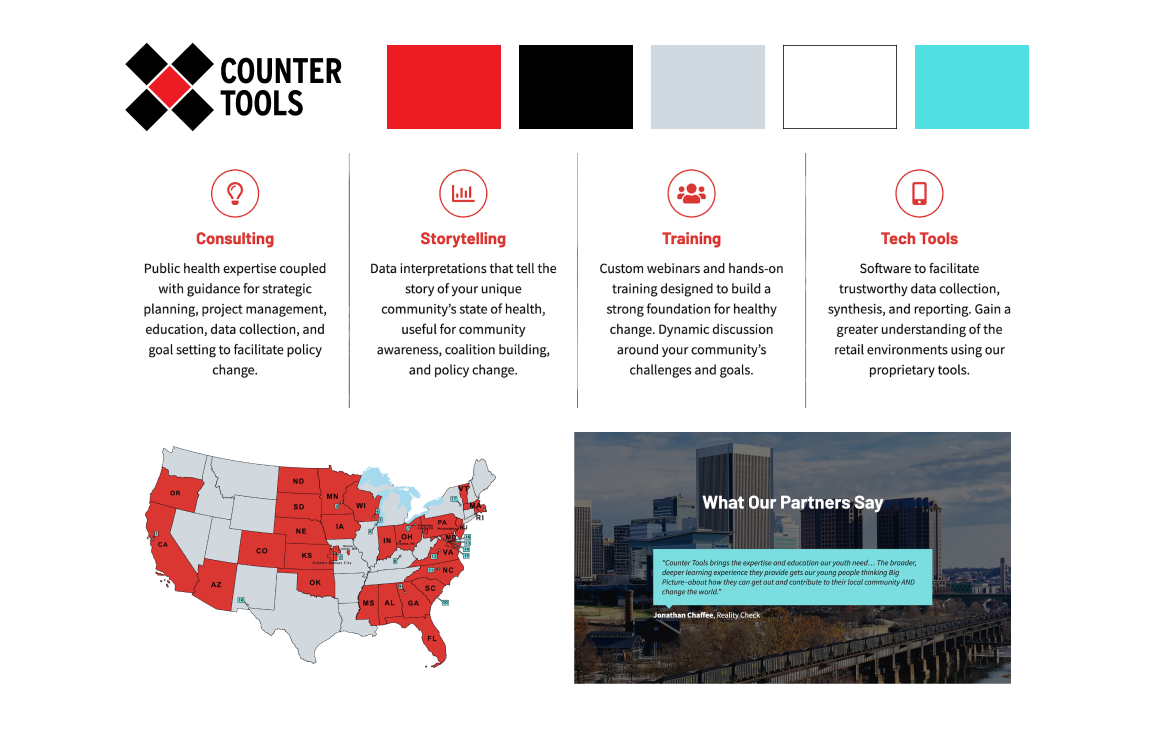
Previous branding
The black and red in their existing identity, coupled with a bold X for the logo, felt alarming, harsh and not at all aligned with how they want to be perceived as an organization.
Strategy & messaging
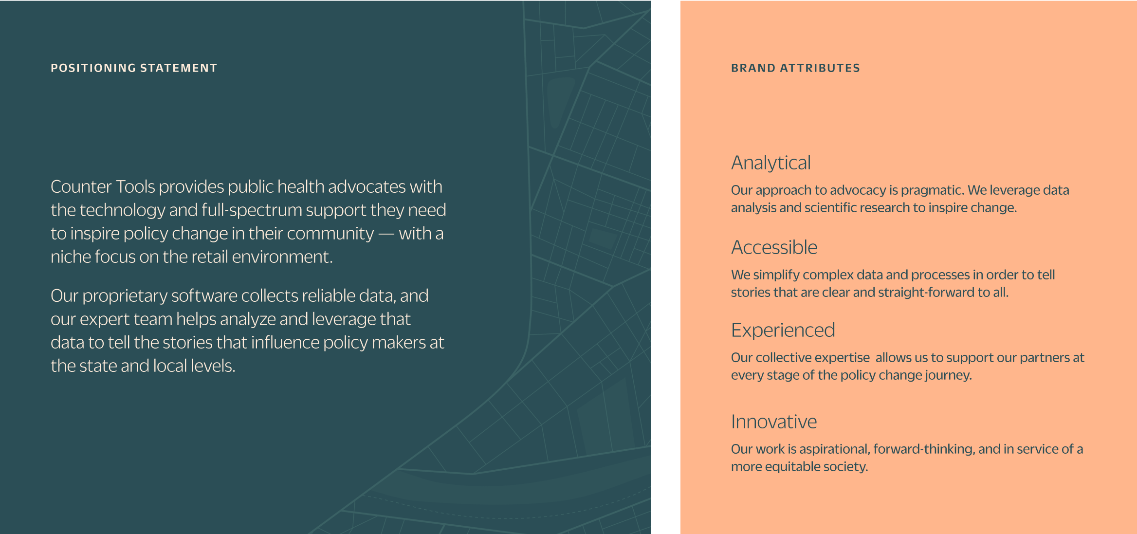
During the strategy session, we developed a competitive analysis, discussed Counter Tools’ target audience and defined how the brand should be perceived. Together, we chose four brand attributes to guide the new identity: analytical, accessible, experienced and innovative.
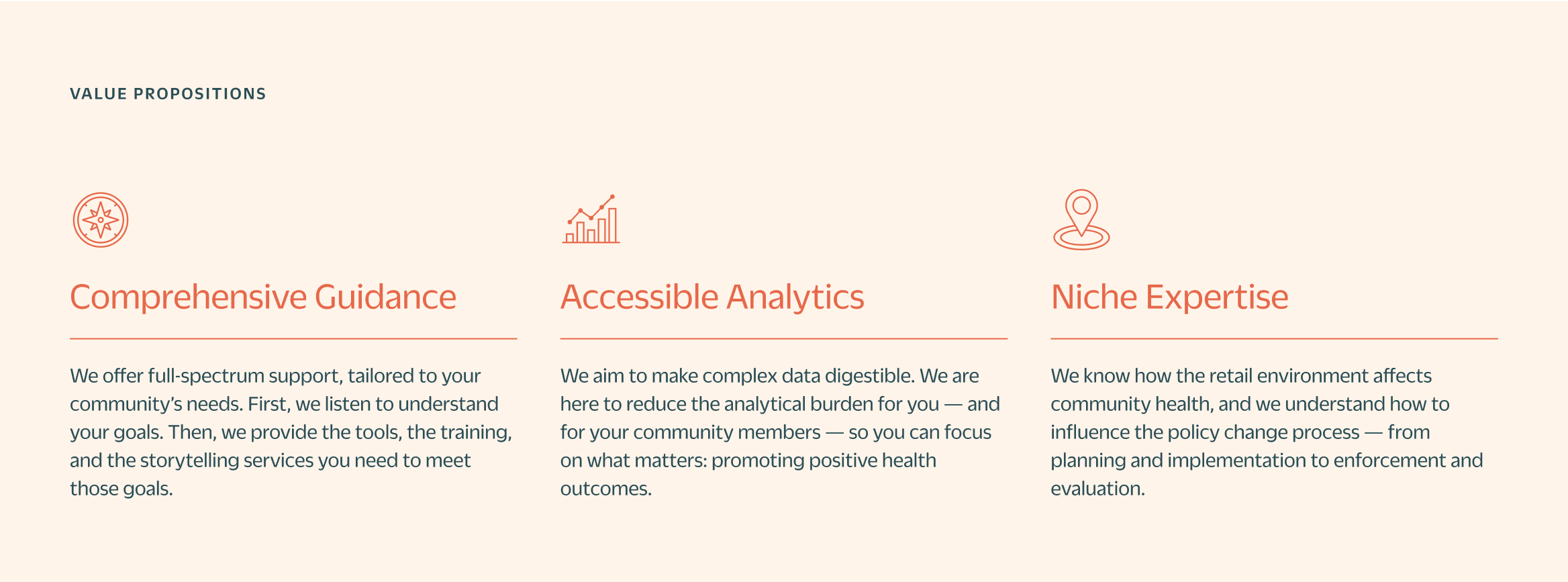
After the strategy session, we were armed with the insights and direction we needed to write a brand positioning statement and value propositions that distinguish Counter Tools from other data-focused, public health nonprofits. We also created a voice and tone guide along with boilerplate copy to help Counter Tools develop consistent, clear marketing and communication assets quickly and easily.
Logo
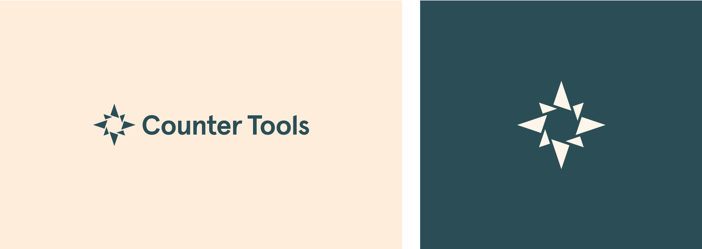
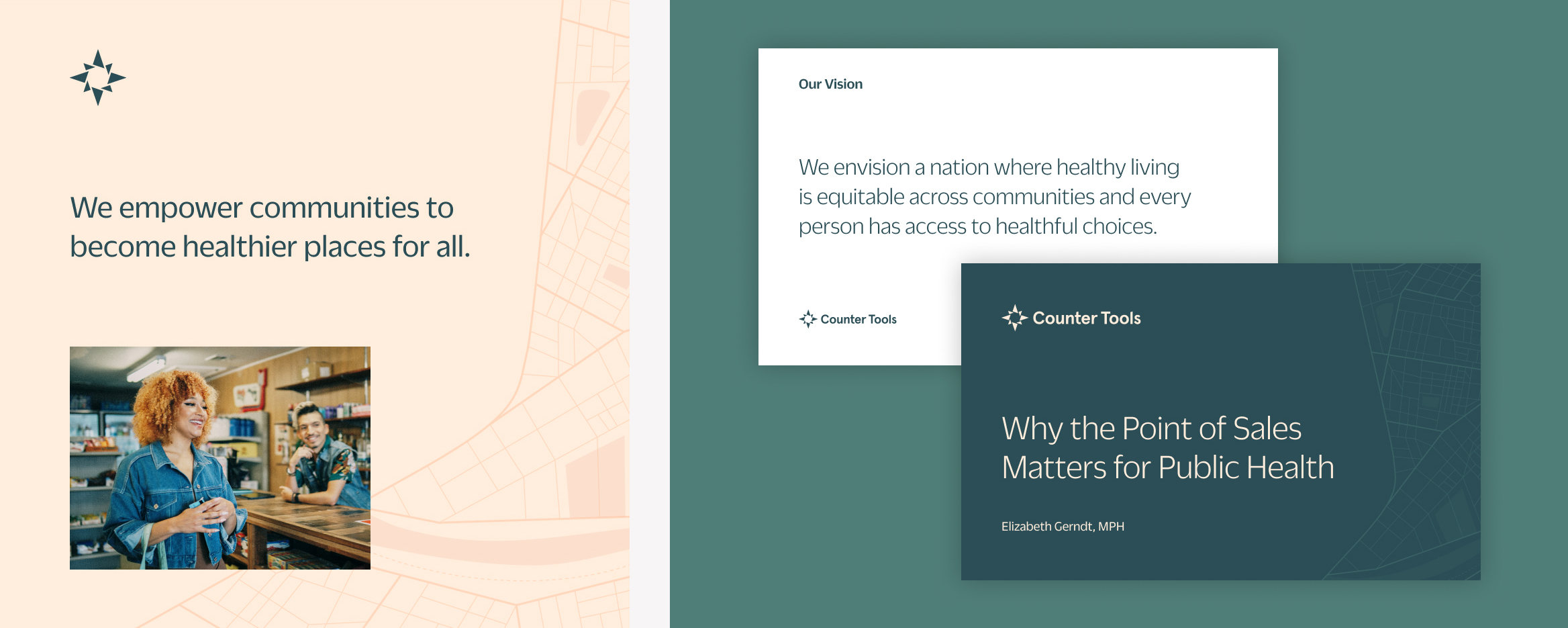
Counter Tools aims to be a supportive partner to their clients, providing geographical, community data and guidance that can inspire policy change. Taking inspiration from both a compass and a star, we created the Counter Tools logomark to represent the well-known geographical tool — and added interlocking triangles that symbolize the interconnectivity of a community and the power of working together.
The logotype is set in Aperçu Bold from Colophon, a contemporary and utilitarian sans serif with an angled, lowercase t. We adjusted this angle slightly, and created matching angles on the uppercase C and lowercase l, to create parallel angles between the compass and some of the letters. Combined, the logo feels clean and cohesive.
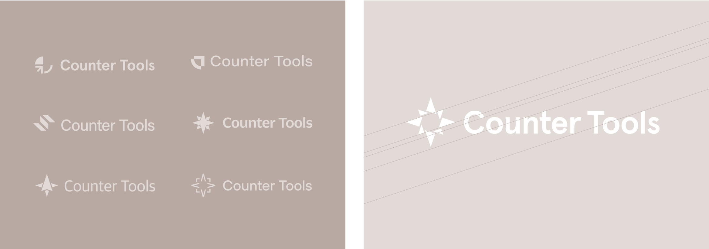
Preliminary logo studies
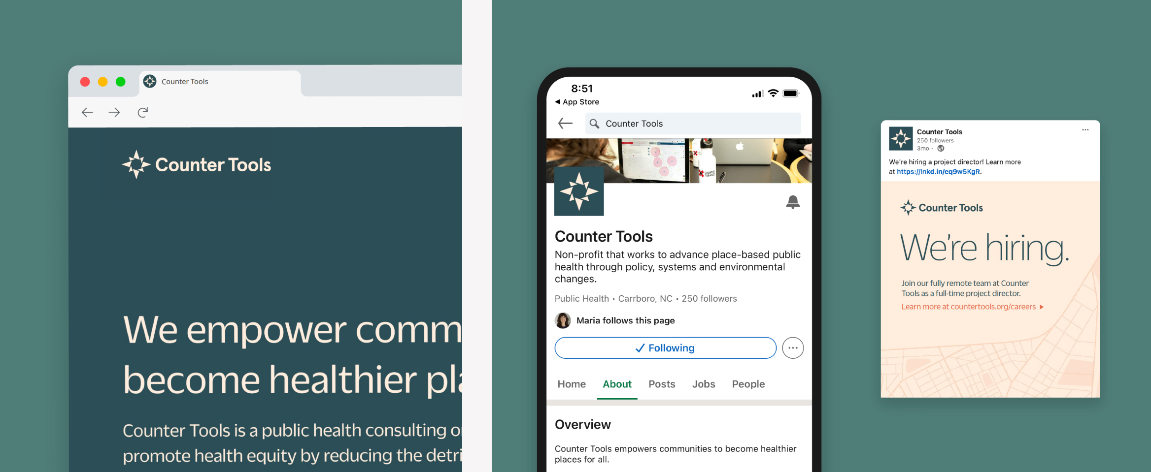
Visual identity
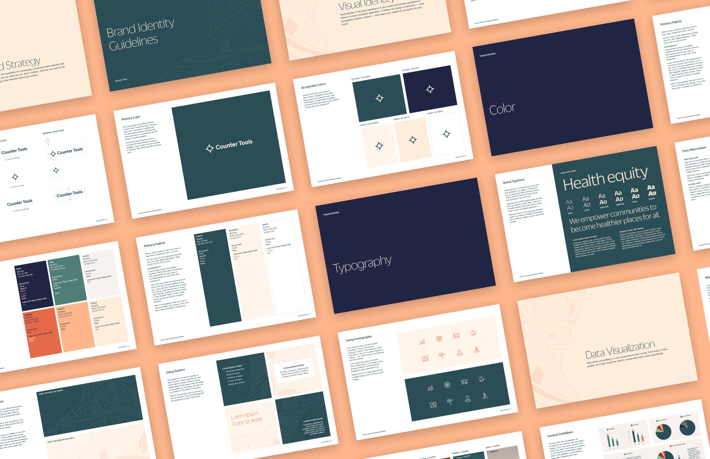
Counter Tools’ official brand typeface is Duplicate Sans from Commercial Type. Duplicate Sans feels sophisticated, uncomplicated and features tapered strokes that feel soft and human.
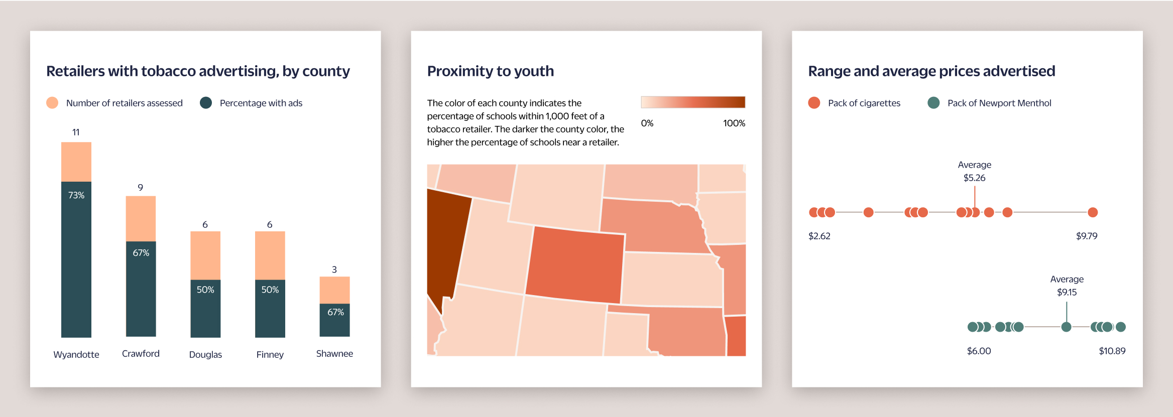
The color palette distinguishes Counter Tools from its competitors by feeling warm, bright and grounded. Green connotes health and action while orange and peach are energizing and inspirational. Cream and tan add depth and warmth while navy conveys trustworthiness and expertise. Together, the complementary colors make each other appear brighter and represent Counter Tools’ innovation, support and pragmatism. We developed a tertiary palette specifically for creating data visualizations — one of Counter Tools’ core services — with contrasting shades of green and purple.

We created a map texture that can be used to frame content and add depth to layouts while acting as a subtle reference to community data. A set of clean, flat icons can be used to emphasize key points or features — and are inspired by navigational tools.
Imagery of people presenting data or in the retail environment helps humanize the brand and highlights Counter Tools’ niche. The photography style is warm and bright, with subtle colors and soft lighting.
“Clarity, depth, innovation and support: small c gave us all of these and exceeded expectations throughout the project. I was impressed by how efficiently and accurately Claire understood our organization’s work. I couldn’t be happier with the project outcomes and expert support small c provided us with implementation.”
— Maria Julian, MPA, Counter Tools Executive Director

Interactive
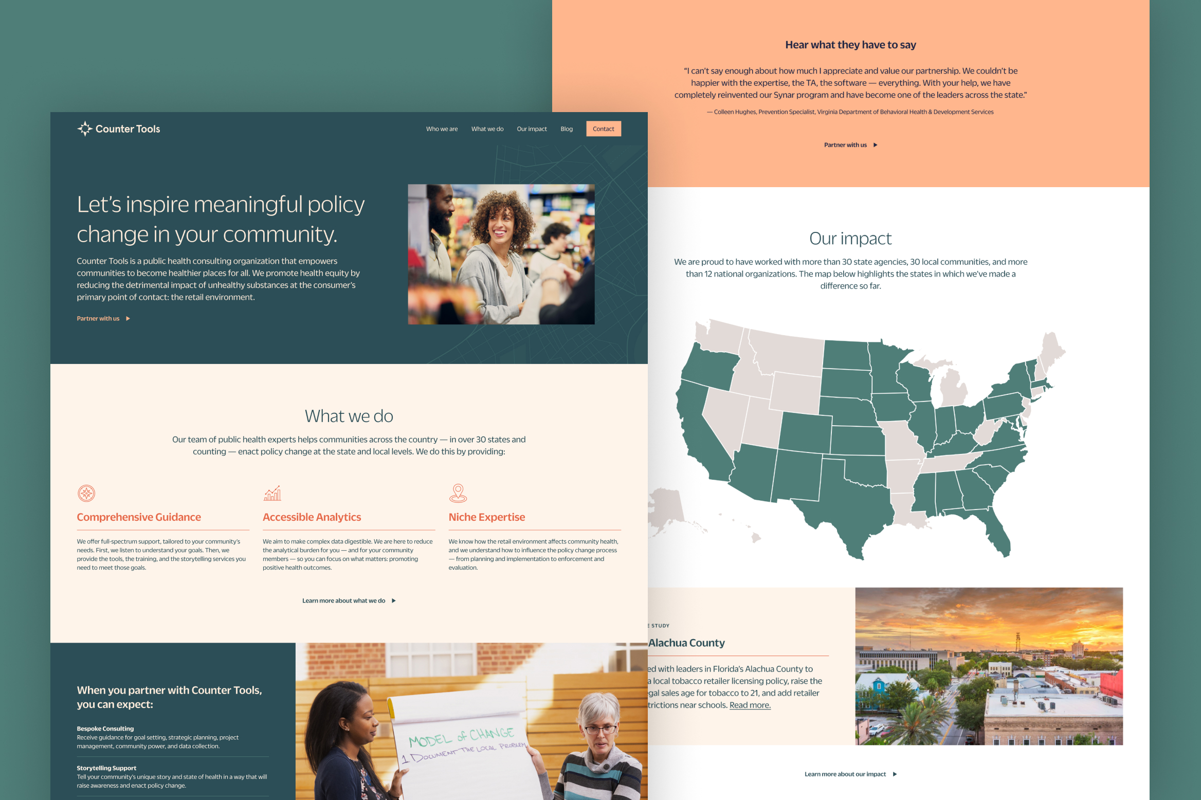
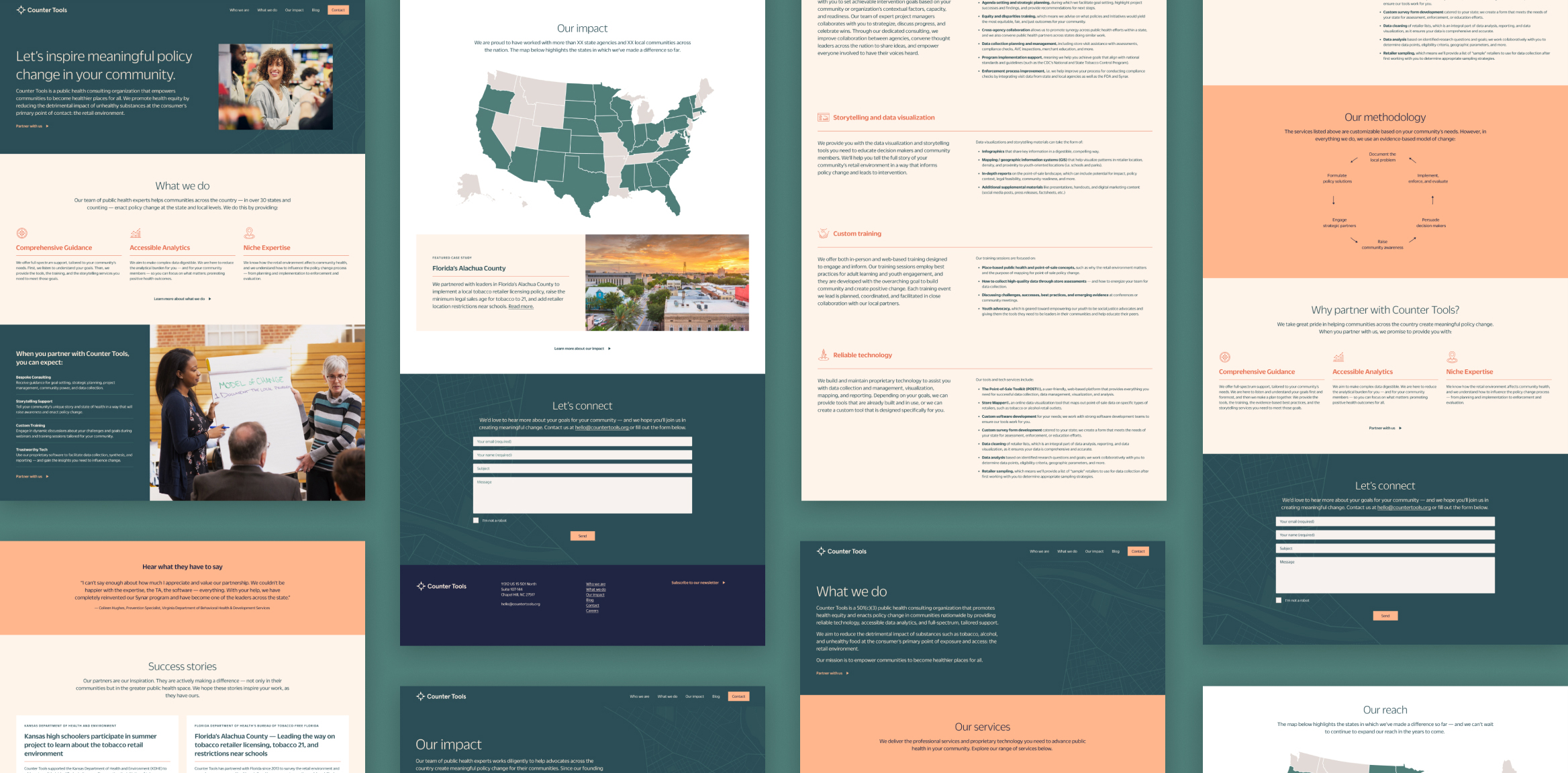
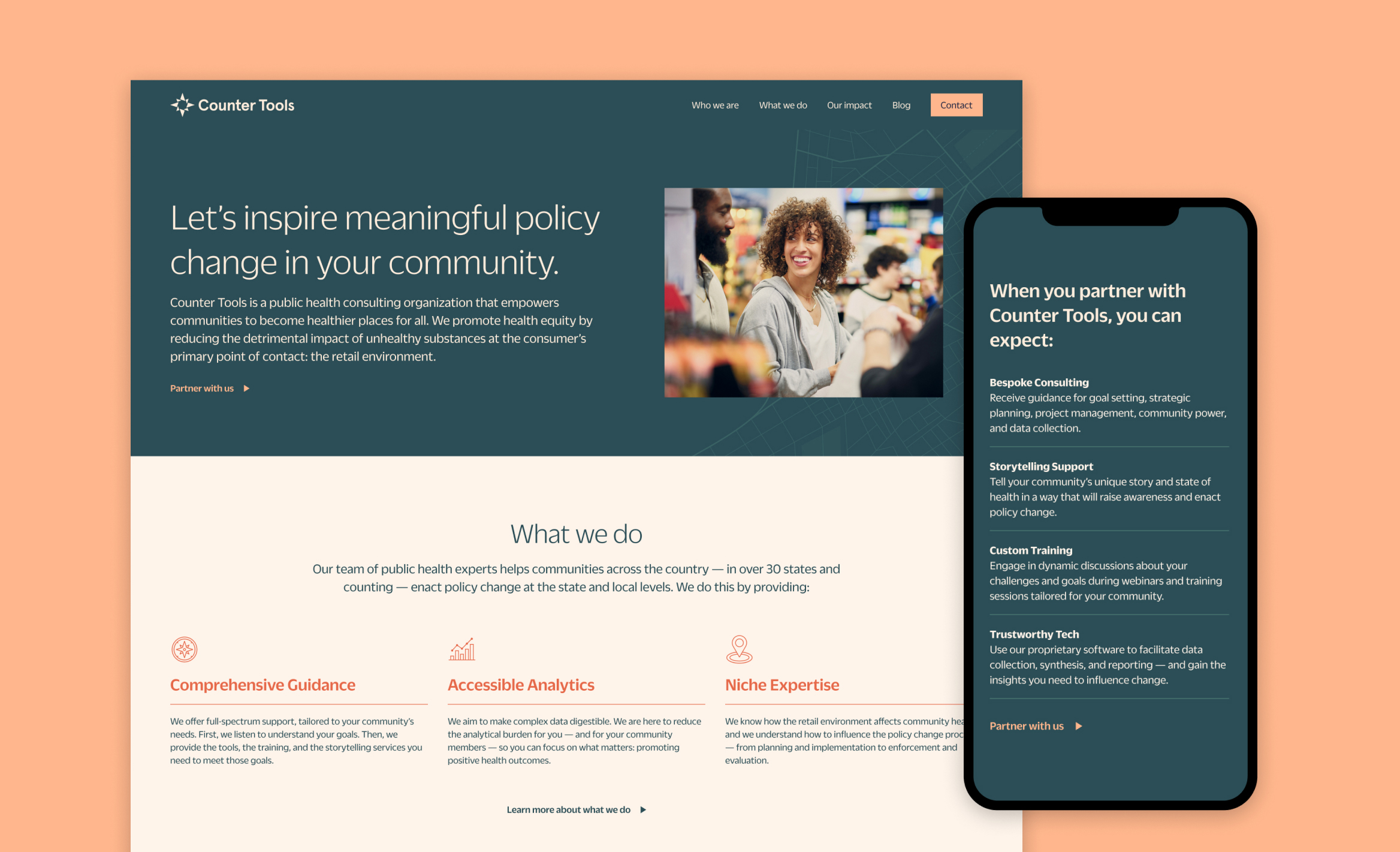
Once the new brand identity was complete, we worked with Counter Tools to determine the best way to implement the new branding on their website, while staying within their budget for the project. We updated the global type styles and colors across the site and redesigned and rewrote three key webpages: the homepage, “What we do” page and “Our impact” page. Our goal was to better highlight their work and services, the value propositions that set them apart from other public health consultants and the impact of their work.
In addition to the website work, we helped develop a user-friendly template in Tableau (data visualization software) so Counter Tools can independently create interactive data visualizations that work within the new branding.
Team
Annie Johnson
Verbal identity & website copy
Amanda Smith
Tableau development
Claire Smalley
Creative direction, design & web development
Let’s collaborate.
We’ll do the investigative work to provide you with strategic, creative solutions tailored to your needs and resources. Tell us a bit about your project to set up an introductory call.