Wild Side Media
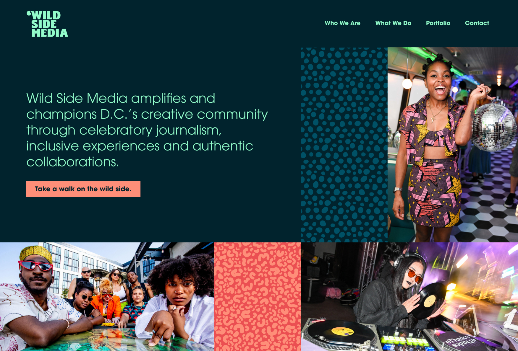
As a women- and queer-owned media company, Wild Side Media champions D.C. creatives and fosters community through celebratory content and inclusive events. We created a brand identity for Wild Side Media’s launch inspired by Andy Warhol’s pop art and Lou Reed’s song “Walk on the Wild Side.”
Scope
Brand strategy
Visual identity
Logo design
Website strategy
Website design
Website development
Brand strategy
To kick off the work we led a collaborative workshop with Wild Side Media’s founder to explore the brand’s target audience, competitive landscape and key differentiators. We then created brand positioning and mission statements as well as three brand attributes that served as a north star for the visual identity: authentic, celebratory and visionary. Finally, we developed three value propositions that set Wild Side Media apart from other media entities.

Concept
During the discovery phase we explored the inspiration behind Wild Side Media’s name (Lou Reed’s song “Walk on the Wild Side”) and the multi-media collaborations between Andy Warhol and The Velvet Underground during the 1960’s. These collaborations brought together an eclectic mix of artists and misfits and celebrated the underground arts and culture scene of the time — a parallel we drew with Wild Side Media and referenced for inspiration. We also leaned into boxy grid layouts as a nod to Warhol’s panelled screen prints.

Logo
With the brand strategy and inspiration in mind, we set out to design a logo that felt bold, funky and celebratory. The final logotype is set in Benoa Black, a contemporary font from Creative Media Lab inspired by retro typography of the 60’s and 70’s. The integration of heavy, straight strokes with soft, curving flairs feels strong, bold and subtly femme. The curving flair of the uppercase W counters the hardness of the other letters, feels playful and nods to the wild side of the brand.
Preliminary logo studies

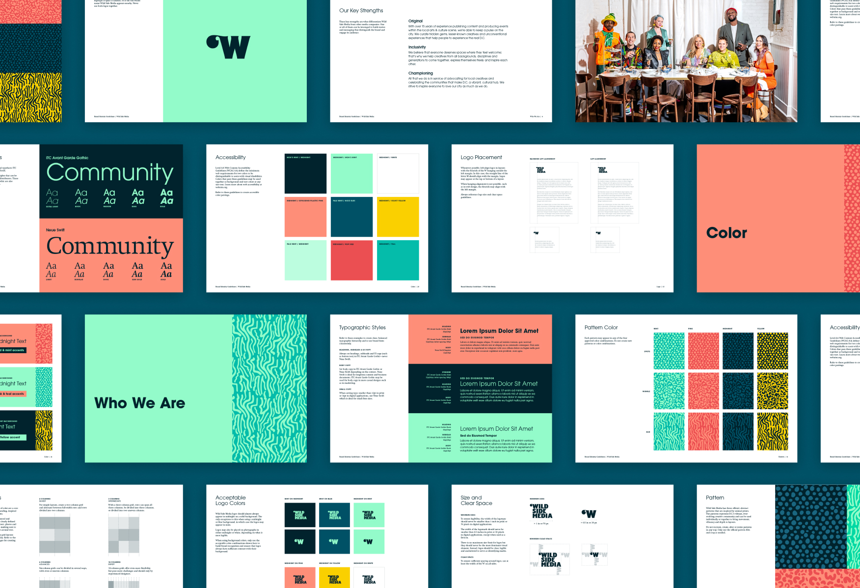
Visual Identity
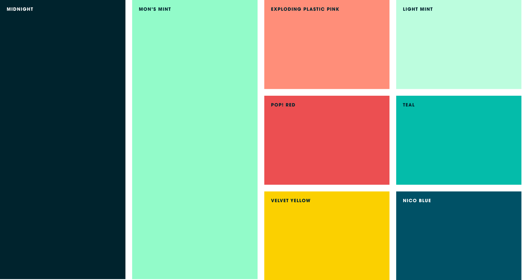
Wild Side Media’s vibrant color palette is inspired by Warhol’s bold, high-contrast screen prints including the album cover for “The Velvet Underground & Nico”. Mint and pink soften the palette and create dimension, especially when combined with midnight.
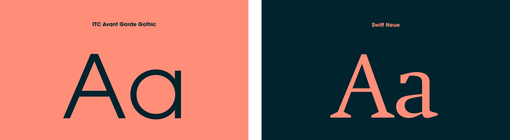
We paired two typefaces for Wild Side Media: ITC Avant Garde Gothic, a geometric sans serif, and Neue Swift, a modern serif. ITC Avant Garde Gothic was originally designed as the logotype for arts and politics magazine Avant Garde, conceived of by the controversial and forward-thinking editor and publisher Ralph Ginzburg. The magazine was first published in 1968 New York City (a year after the release of the album “The Velvet Underground and Nico”). Neue Swift is optimized for both print and digital applications although it was originally designed for newspapers and magazines. Both typefaces are distinct and modern while paying homage to the history of editorial design.
To contrast the structured layouts, we designed three patterns that were inspired by animal prints and represent D.C.’s dynamic creative community.

Brand Support
In addition to a logo and comprehensive brand guidelines, we designed and developed a website, media kit, presentation template and social media templates to support Wild Side Media at launch and beyond.


Team
Claire Smalley
Creative direction, strategy, design & development
Let’s collaborate.
We’ll do the investigative work to provide you with strategic, creative solutions tailored to your needs and resources. Tell us a bit about your project to set up an introductory call.