
EnergyHub
A cohesive brand refresh driven by strategy, worthy of an industry-leader
EnergyHub provides software and services that empower utility companies to build a more sustainable power grid. As pioneers in virtual power plant management software, they needed a brand identity that balances their industry leadership, technical expertise and collaborative approach.
Scope
Brand guidelines
Brand strategy
Brand support
Visual identity
Website design
Website development
Brand strategy
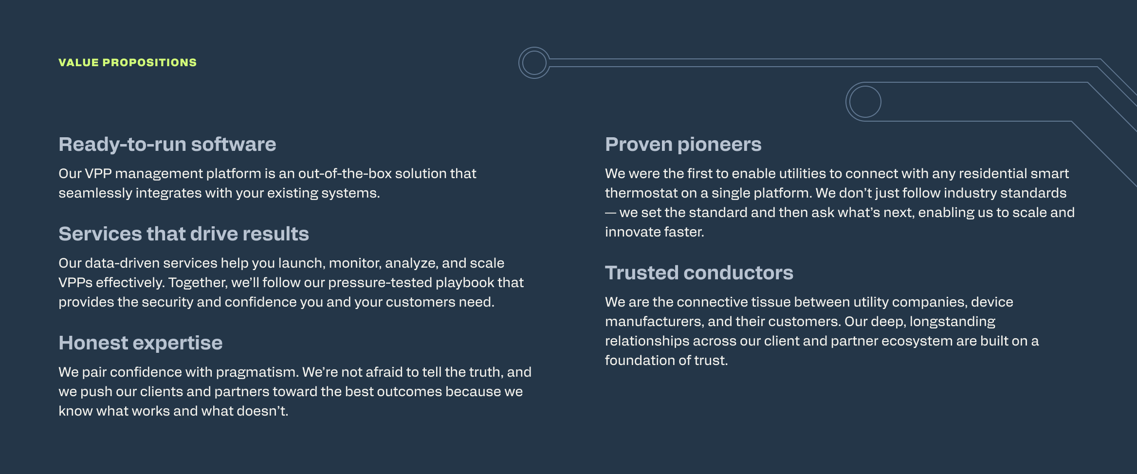
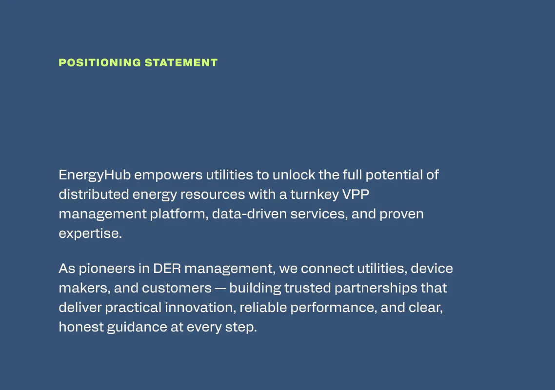
Our first challenge was to understand the value EnergyHub brings to their industry and translate it into concise, jargon-free language. We led EnergyHub’s leadership team through our signature Brand Lab workshop, a series of discussions and activities, alongside a competitive analysis. From there, we presented brand attributes, value propositions and a positioning statement that captured what we’d found.

Visual identity
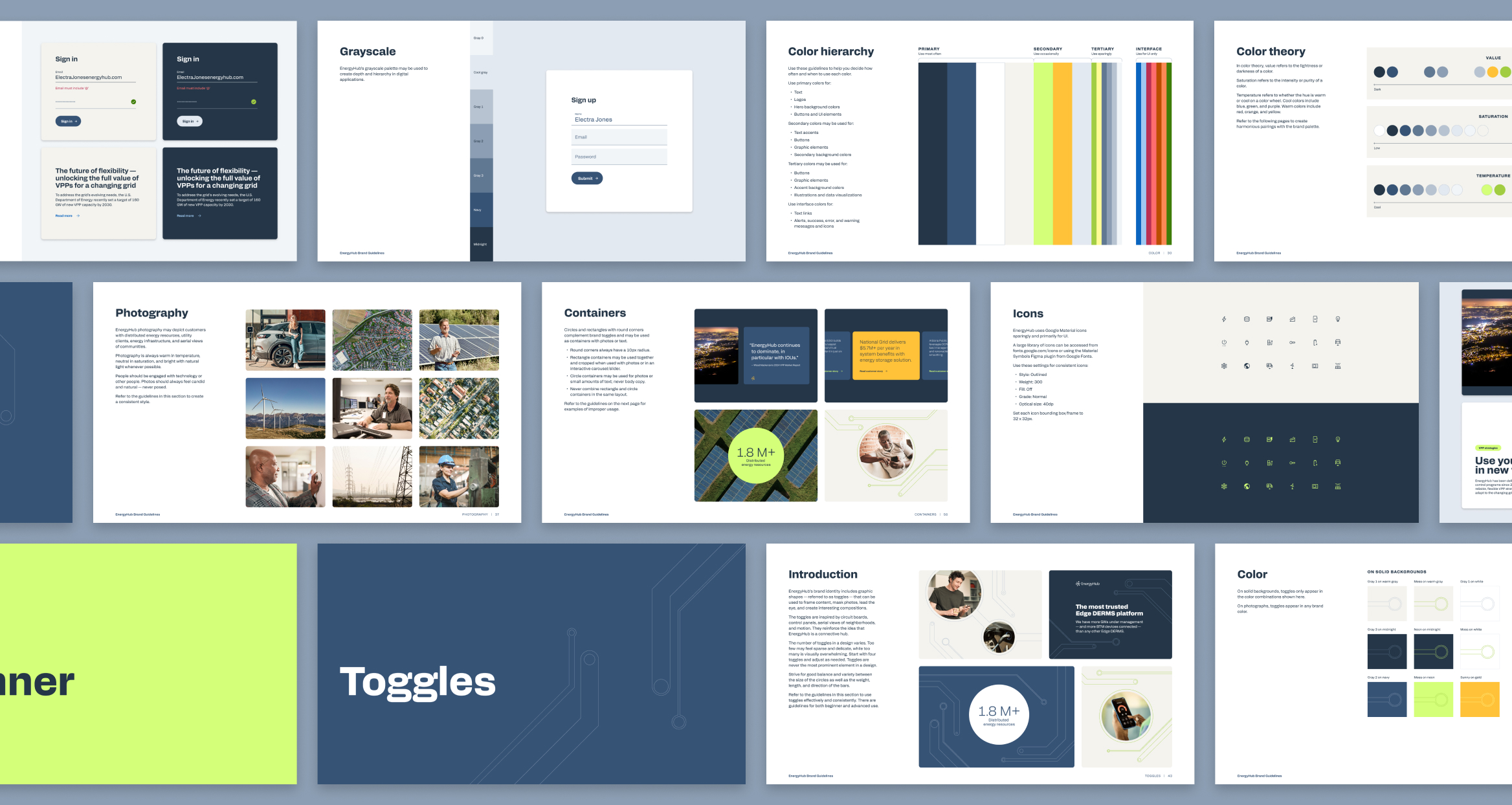
With a clear brand strategy as our foundation, we redesigned EnergyHub’s visual identity within two parameters set by the client: keep the existing logo and the colors navy and gold.
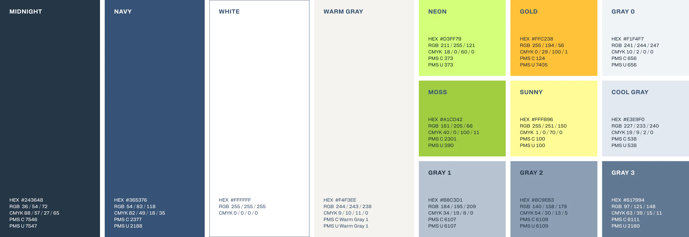
We iterated closely with EnergyHub’s team to land on a palette that feels both true to the brand and distinct in their industry. It’s built around a softer and more sophisticated navy, an almost-black grey and an electric green as a primary accent. The result feels confident, grounded and bold.
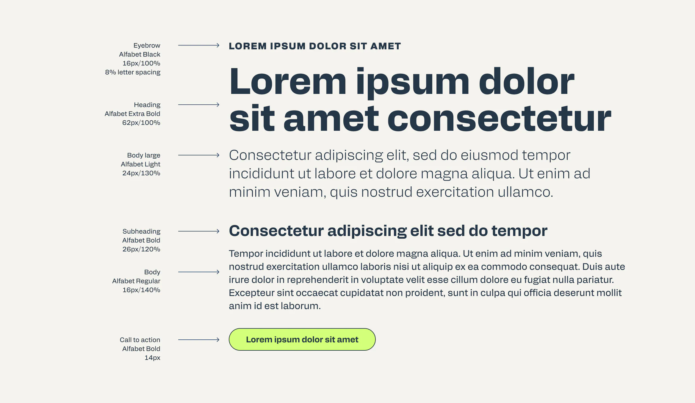
The brand typeface is Alfabet by Capitalics, originally chosen and beloved for EnergyHub’s consumer-facing child brand. It feels both technical and approachable, and using it again brought continuity between the two brands so they feel like part of the same family.
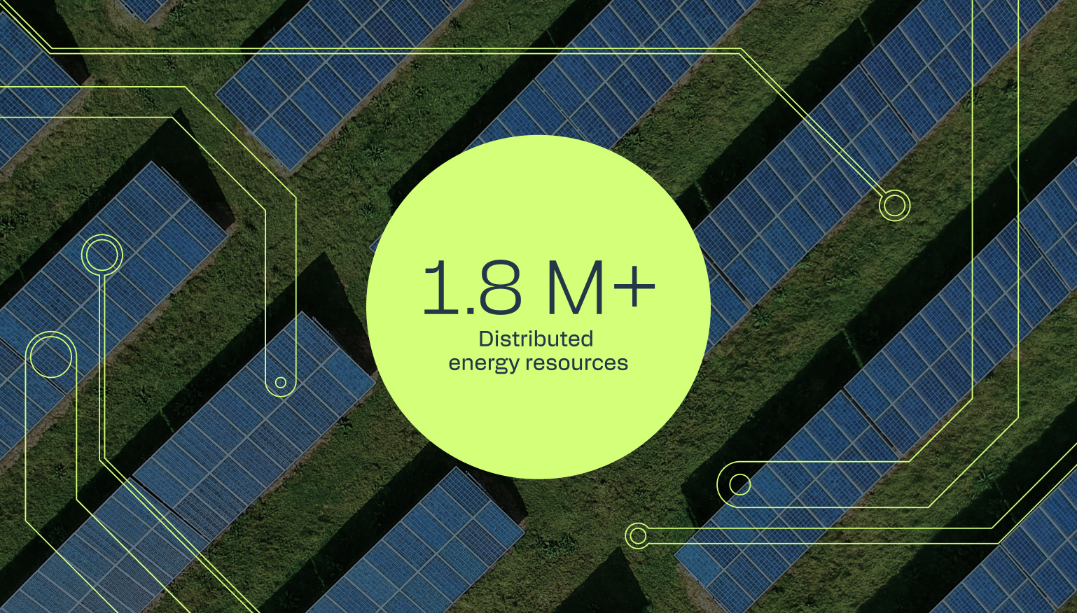
We also introduced an original graphic element inspired by circuit boards, control panels and aerial views of neighborhoods. These shapes reinforce the idea of EnergyHub as a connective hub.
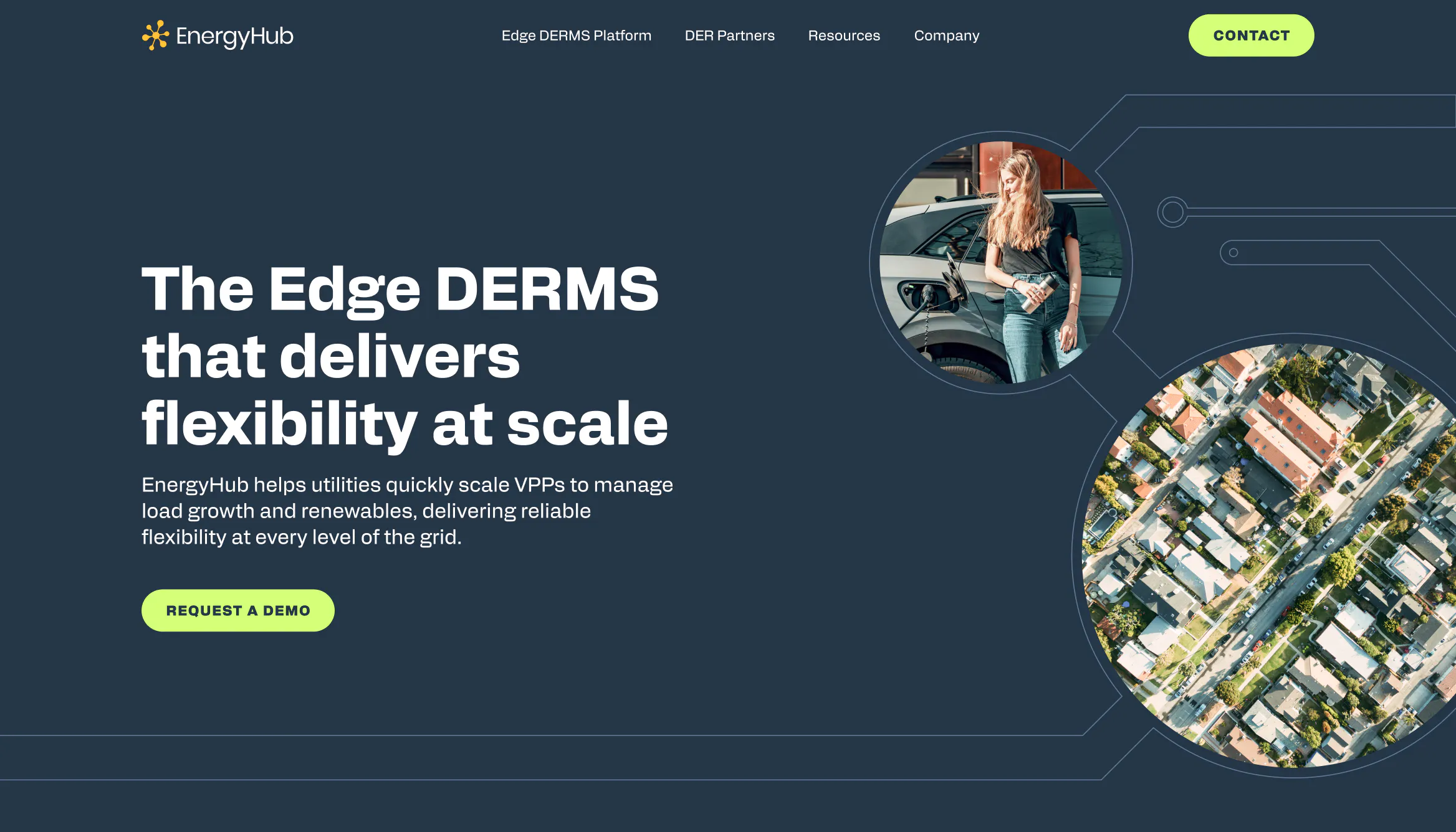
Warm photography balances the cool palette and centers the people who use and are affected by the grid, in an industry that tends to center technology and infrastructure. Photos of infrastructure as abstract textures help contextualize content without becoming the focal point.



“Thank you for bringing such a beautiful perspective to our team, balancing all our feedback, and being such a stickler for details. Your hard work has been so critical in advancing our brand.”
— Julie Potyraj, EnergyHub Brand Director
Website
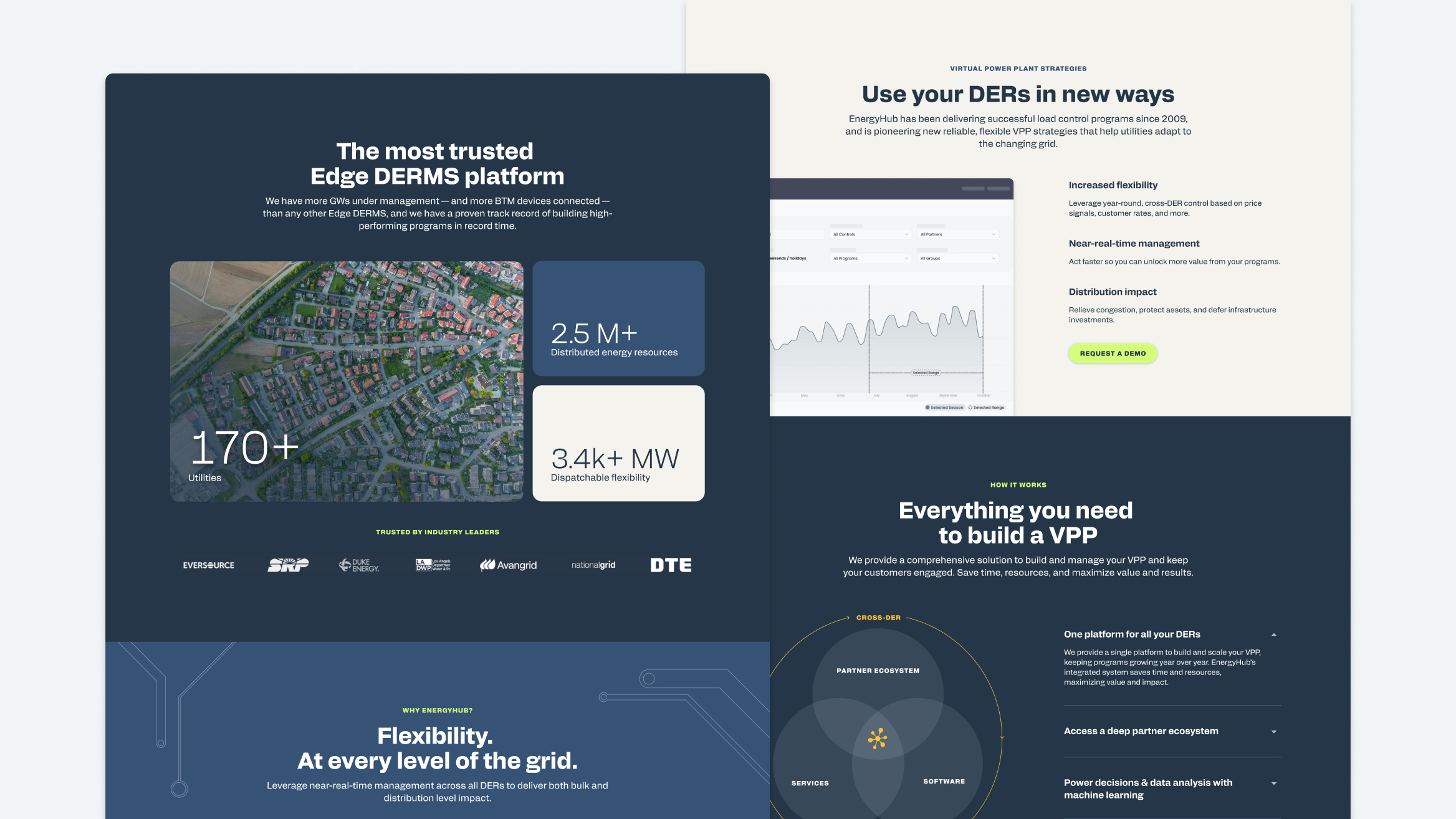
EnergyHub needed the new branding implemented on their website but — after two previous redesigns — didn’t want a total rebuild. We reskinned the site’s global styles (colors, fonts), redesigned the homepage and developed a library of reusable modular components the team could use to build new page layouts independently — reducing the need for another redesign later.
Brand support
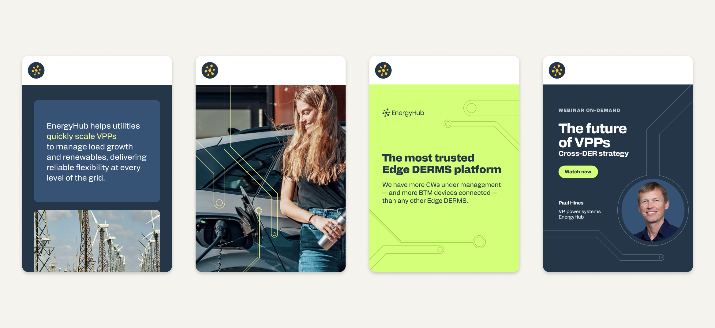
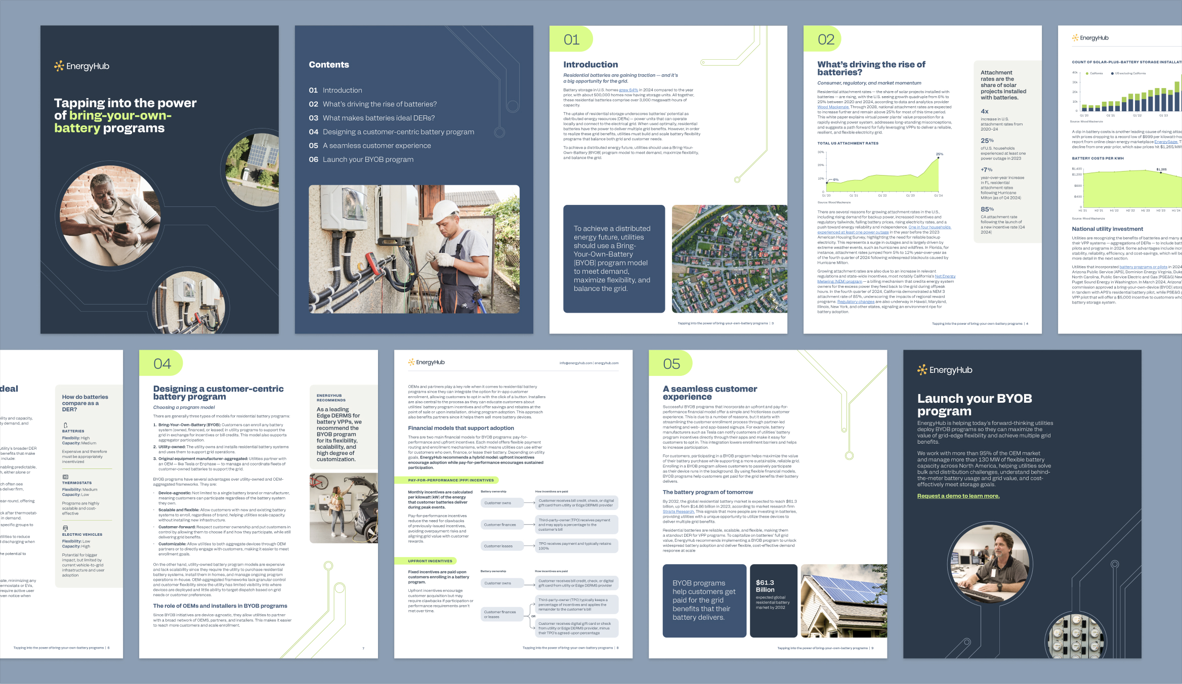
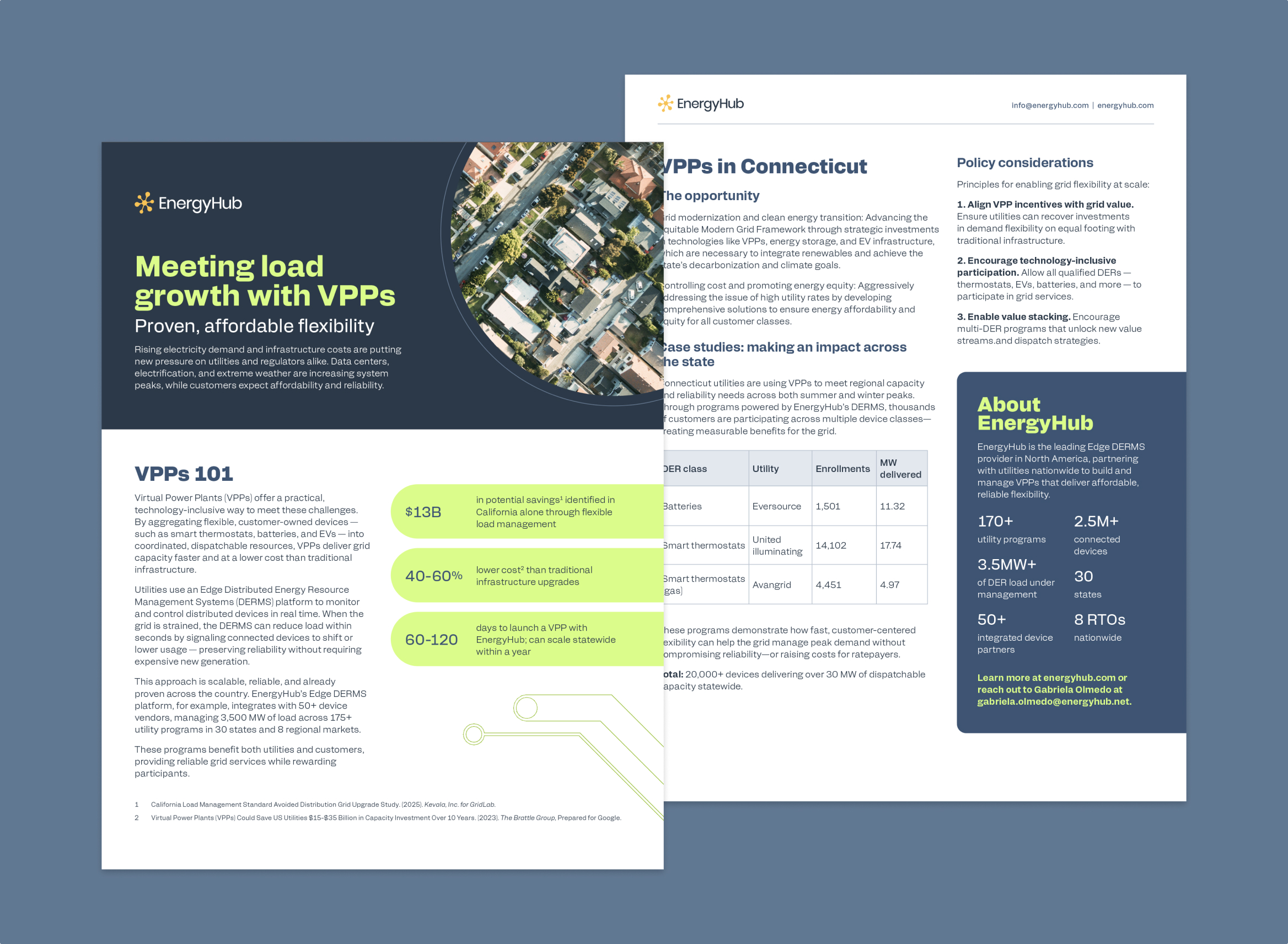
We supported EnergyHub throughout their brand rollout by redesigning white papers, one-pagers, event materials, and more. And with a new brand manual, clear brand strategy and detailed design guidelines, EnergyHub’s small marketing team is now able to create assets with consistency, confidence and ease.
Project team
Claire Smalley
Annie Johnson
Outside Studio