EX by Truth Initiative
EX is a tobacco cessation program developed with the Mayo Clinic Nicotine Dependence Center and run by Truth Initiative, the largest non-profit, public health organization in the U.S. dedicated to ending tobacco use. We worked closely with the team at Truth Initiative to reimagine EX’s visual branding and develop a UI library for their product, becomeanex.org.
Scope
Brand strategy
Visual identity
Website design
Product design
UI/UX

Approach
As EX grows to serve a broader audience, their team recognized the need for a new visual design system. The overarching goal was to encourage and welcome a diverse range of tobacco users; people of all ages, at any stage of the quit journey, with varying levels of digital literacy. EX would keep the existing logo, but the visual identity, content layouts and UI of becomeanex.org needed to evolve.
At the time, the EX color palette was primarily red and green, which posed a challenge in UI design where those colors are often associated with success and error messages. Paired with white, the red felt medical and without any secondary colors, designs generally felt sterile and flat. Furthermore, becomeanex.org has a wealth of great content that needed to be easier to navigate.
We worked closely with the EX team at Truth Initiative to understand their users and the value of the program before developing a new brand identity. Defining brand attributes and key strengths was a key first step to ensure the visual design would be grounded in strategy.


Color & typography
We leaned on color to visually connect EX with Truth Initiative, their parent organization. The greens and oranges in EX’s new secondary palette are Truth Initiative's official brand colors. We also included Truth Initiative’s official teal and, from it, created a rich, dark teal as one of EX’s primary colors. The result is a palette that feels fresh, inviting and energetic.
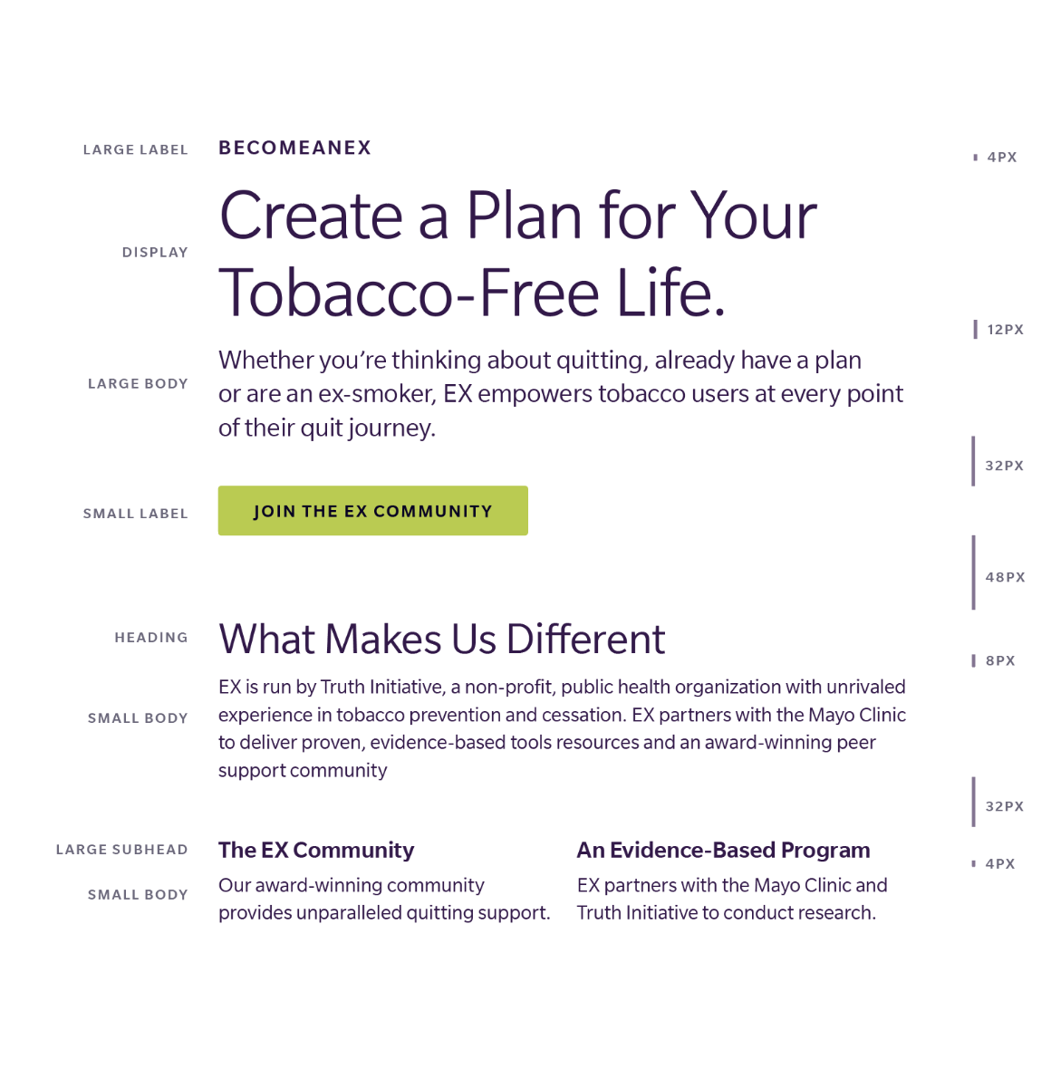
While exploring typography, it was critical that we created a system that was highly legible and accessible to people of all ages and abilities. Slate is a contemporary sans serif that achieves stellar readability, both in print and on screen. The letterforms exhibit characteristics of both humanist and geometric styles to produce an aesthetic that feels clean, approachable and refined.


“small c created a visually stunning, creative, market differentiating visual design strategy and system for our organization.”
— Shannon McConnell, Truth Initiative Product Designer

Visual Identity
Photography is a key part of the visual identity. It celebrates the strength, support and diversity of EX members and feels friendly, natural and relaxed. Images highlight social environments, outdoor hobbies and activities where tobacco users might experience triggers to convey the freedom of a tobacco-free life. Images of people hiking, driving and in motion represent the idea that quitting tobacco is a journey.
We created a pattern made up of plus signs (or rotated X’s) that represents the positive changes that people can experience on their quit journey. It also feels like an interlocked network that symbolizes the EX Community, highlighting that members are not alone. The pattern is used as a framing device that creates depth and texture in layouts.
A set of icons symbolize the journey of quitting tobacco and are used to highlight key tools and features offered by EX.


Interactive
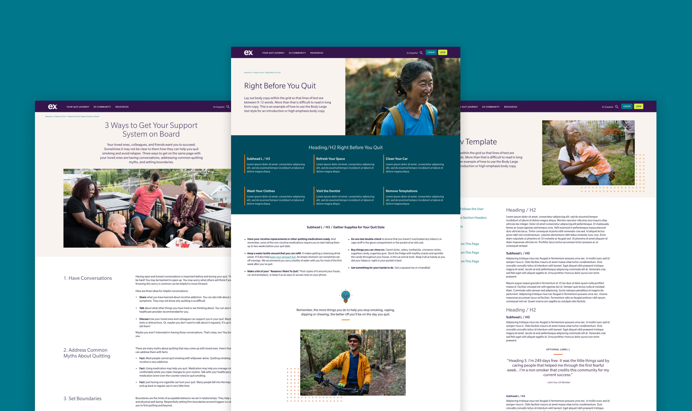
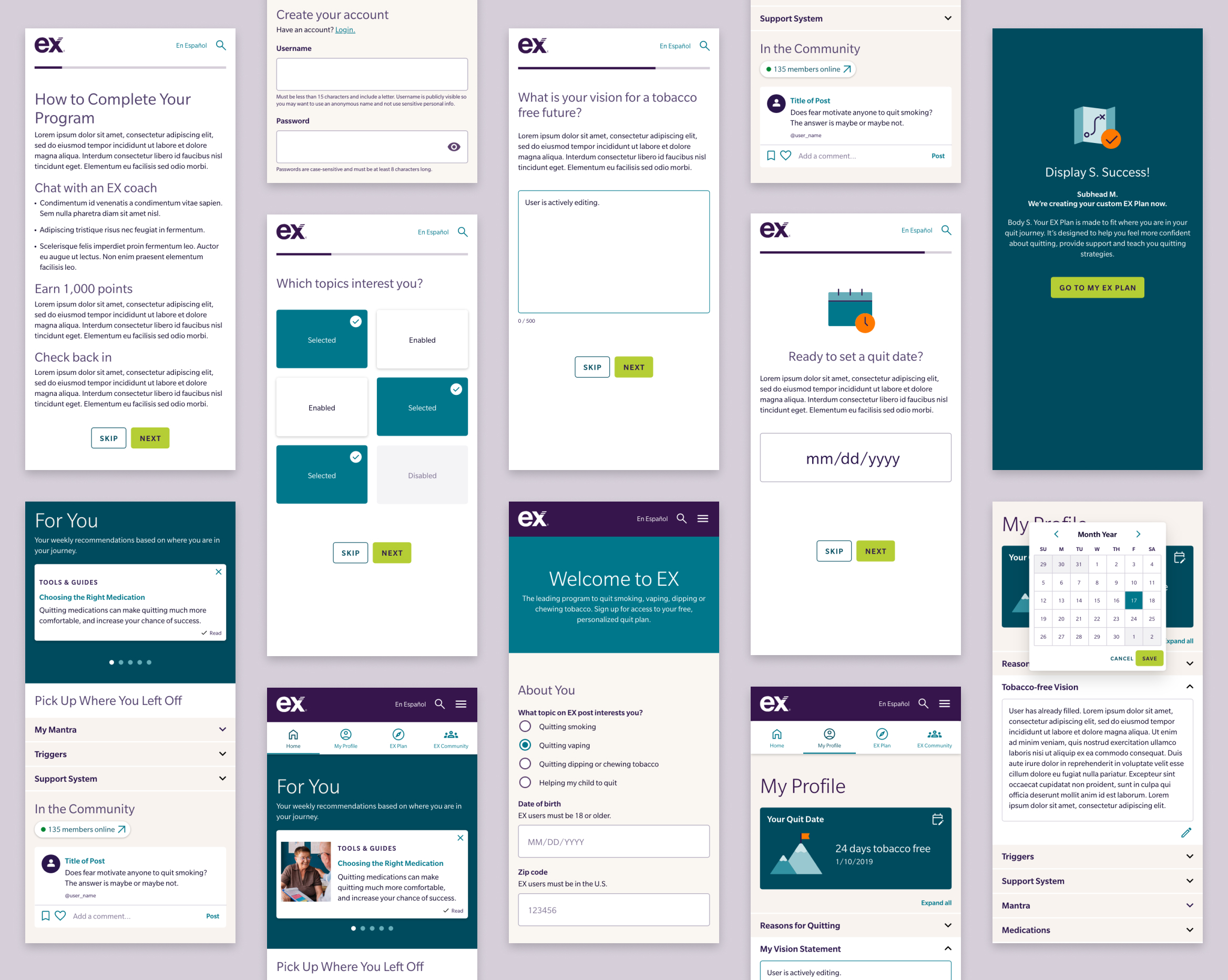
The EX website includes a wealth of information, tools and resources developed in partnership with Mayo Clinic. In addition to applying the new branding, we designed page templates to make the content more scannable and less dense. We also developed a library of UI components that the internal team could use to continue the website redesign without us.


Team
Claire Smalley
Creative direction & design
Let’s collaborate.
We’ll do the investigative work to provide you with strategic, creative solutions tailored to your needs and resources. Tell us a bit about your project to set up an introductory call.